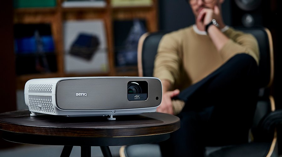
BenQ devotes a substantial amount of resources to create products that include the latest technologies and are also easy to use. We believe that the subtler benefits of an ergonomic design are worth the extra steps and that our users deeply value them. That is why we have revamped the design of our projector’s function keys to avoid accidental or incorrect presses and confusing menus.
The new keypad buttons on our projectors meet all the essential aspects of good UX design by providing a beautiful layout that is pleasurable and easy to use. Our team kept three crucial elements in mind when working on the new keypad design: aesthetics, intuitiveness, and usability.
First, we made sure that our overall design is clean and straightforward. When you see the projector installed on the ceiling or sitting on top of a table, the keypad buttons shouldn’t be the most notable feature. We place our keypad in the right spot and keep appropriate proportions to improve ergonomics.
Then, we took a good look at what icons we were using and asked ourselves if their meaning is always evident. The function of each key should be stated clearly using text and icons to avoid any need for guessing and mistakes. Even the location of a specific key can tell the user a lot about its function.
Lastly, we evaluated all these decisions in terms of usability. Looking good and having an apparent function only provides a real ergonomic benefit if it improves usability for the end user. During testing, many design decisions get scrapped, while unforeseen needs become apparent.